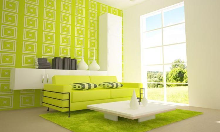
Colour is a big part of design, whether you’re getting a new landscape design or doing an internal renovation, it can seem a bit overwhelming to choose a colour palette for the whole house. Having the same neutral colours for every room is what you find in rentals. When it comes to your own home, you want something a little more distinctive and up-market than that. Here are some tips on how to choose colours that go well together without being bland and boring.
- Walk through the home with a pen and paper and jot down which other parts of the home can be seen from each room. This will ensure the colours chosen for each room will go well together with the colours that can be seen from there. Using a rough sketch of the floor plan is an easy way to keep track of it. It is not only the adjoining rooms that may be seen but places like the hall through to the kitchen.
- Choose a colour for the room that is the biggest and most central to the whole house. Feeling stressed? Choose a soft, neutral hue for this room and that will make it easier to choose colours for the other rooms. But if you love colour and want to have at least one room painted in bold colours, start from that room. Then looking out from that room, choose somewhat softer colours for the rooms or spaces you can see from there. That’s not to say you can’t use bold colours next to each other, but there is an element of risk in doing so. You don’t want the colours to clash.
- Having picked a colour for one room, the idea is to choose similar shades or hues for the adjacent rooms. A paint chart can help you with this. The benefits of doing this is that you can be sure each colour will look good together while still adding interest and depth. It is especially good for a home where there is an open floor plan; much of the house can be seen from one main room.
- Another way to go about choosing colours is to look at the environment around your home. Colours that go well together in nature will usually look fine within the home as well. Consider a beach environment with sparkling white sand, aqua blue or green of the ocean topped with sky blue and with accents of grass or tree green in the background.
- Keep connecting spaces such as hall and stairways fairly neutral unless the rest of the home is very light and neutral. In that case, choosing bolder colours for the connecting spaces will create visual interest and can be a good way to experiment with richer colours.
How to Choose a Colour Scheme For Your New Home

